OUR BRAND
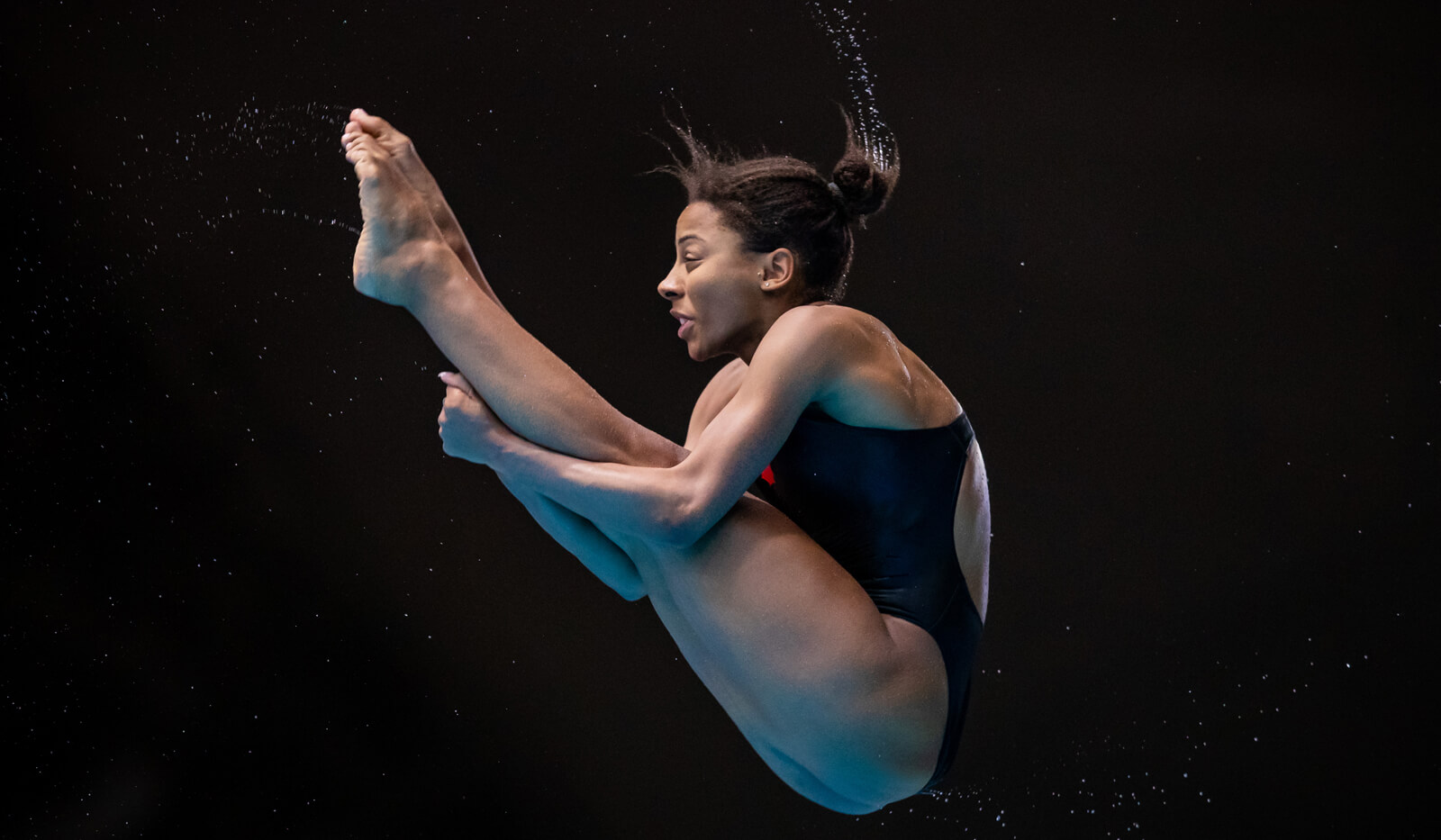
To most people, gravity is an unbreakable rule. It is an accepted force, a part of life we have no control over.
To a diver, gravity is a bull to be tamed. A universal force to be wrestled to the ground and made to do their bidding. It is a diver’s most beautiful canvas.
At Diving Plongeon Canada (DPC), we own doing the impossible. We thrive on doing things that “cannot be done.” While our rivals may be divers or nations, our ultimate competition is gravity. Our main opposition is physics. We spend each day defining and redefining gravity on our own terms. Gravity is what we say it is.
OUR SYMBOL
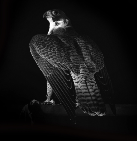
The peregrine falcon is our symbol. With an incredible performance of 320 km/h, the fastest bird on earth is Canadian. Extremely beautiful and elegant, the peregrine falcon is an efficient flyer with an iron will. Sounds familiar?
Well known for its hunting stoop or, in another words, its high-speed dive, it is small, but mighty. It is resourceful, powerful, impressive and courageous. All of those characteristics describe perfectly the federation and its members
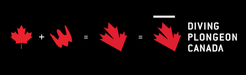
OUR LOGO
The maple leaf (our national pride) the peregrine falcon (our symbol) and the top of the podium (our focus) are the elements that inspired the creation of Diving Canada’s logo.
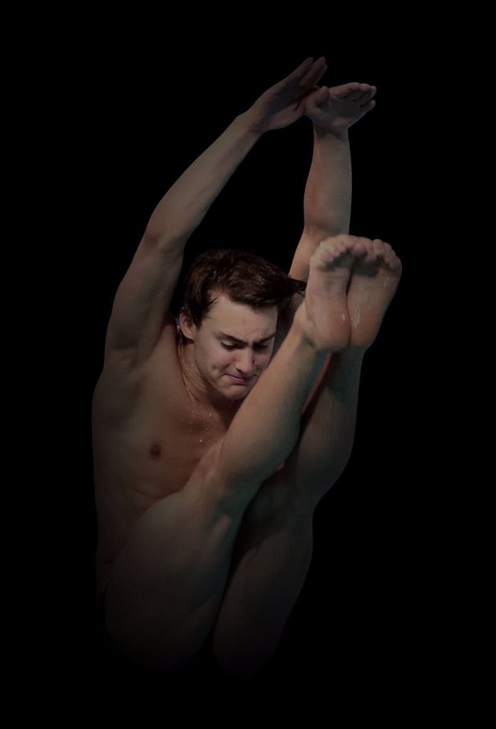
WE FLY
WE FLY means that we tell gravity what to do and how to do it, as we defy its rules. It means ‘impossible’ is just a word to us. It means that we can achieve what others would not even attempt. It means we will not shy away from greatness. It means we are not afraid of the unknown. It means we dream big.
While the spectators are usually focused on the divers’ water entry, the slogan brings our attention to what happens when they take-off, where for a precise moment in time, they define gravity and they fly.
BRAND VIDEO
© Diving Canada 2020 / All rights reserved